Stirring things up at Sweetish House Mafia
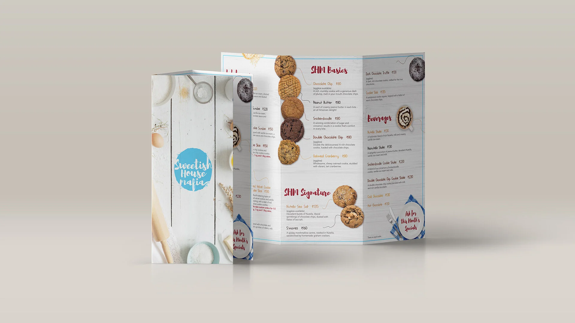
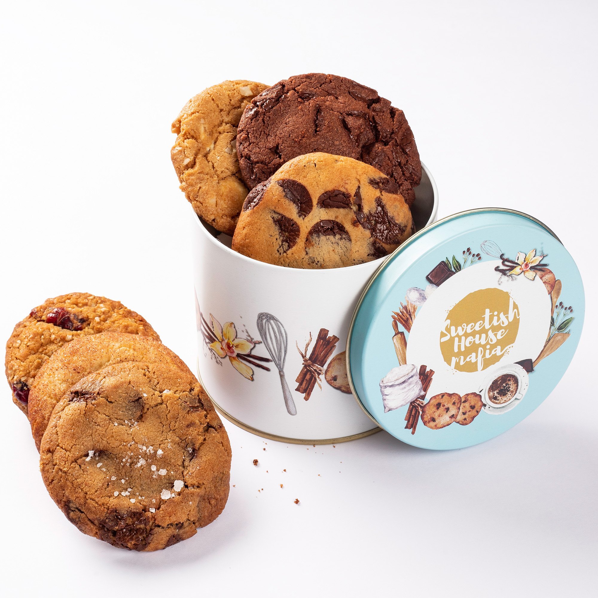
Sweetish House Mafia first appeared on everybody’s radar as an anonymous, bright blue Tata Nano that would park itself at different spots around Mumbai, setting up shop to sell freshly-baked, homemade cookies. The cookies developed something of a cult following, with people stalking the van on social media, and lining up late into the night for the perfect, fudgy/cakey/chunky cookie. Sweetish House Mafia opened its first brick-and-mortar store in 2014, and since then, they’ve been on a roll. We were given the opportunity to conceptualise and execute their brand identity design, including a thorough refresh and redesign of the product packaging, marketing collateral and retail customer experience.
As the company began thinking bigger, expanding into new locations all over the country, their menu had begun reflecting this atmosphere of innovation and growth (cookie pizzas!, gourmet chocolate sauce!, Nutella cupkies!). What Sweetish House Mafia needed was an identity that would encapsulate these diverse offerings, while paying homage to the product that started it all: the cookie.
For a brand that was once referred to as ‘the Batman of cookies’, we wanted to stick with the spirit of playfulness, generosity and homemade goodness that the team stayed true to, even as it evolved into a major business. The logo can be viewed as a cookie in the process of coming together, or a messy splatter of flour or icing sugar or chocolate - a mixing bowl of elements continuously combining and transforming to form delectable, gourmet products. The logo font mimics handwriting, almost like it was written with a finger, dragged through flour.


